- Is time travel possible?
- Gold wipes the slate clean
- Exxon, selling at 15 year lows
Do you own the world’s biggest oil company? Of course I’m
talking about Exxon (NYSE: XOM) – and odds are if you’ve
invested in a mutual fund or broad index, you do own Exxon.
But what if you could go back in time and buy Exxon in 1996,
at under $20 a share?
Nearly 15 years ago, Exxon had yet to merge with Mobil, the
largest industrial merger ever.
But they were still a huge company with a long track record
of profits.
Buying Exxon Mobil at $20 a share would let you lock in a
near-triple at the company’s current share price of nearly $60. Okay, so a
triple over 15 years isn’t going to sail any ships.
In any event, time
travel isn’t possible – at least backwards time travel. Unless…
Take a look at this 20 year chart below, which plots the
price of one share of Exxon divided by the price of one ounce of gold.
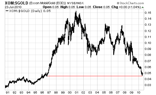
You can see that relative to the price of gold, shares of
Exxon are as cheap as they were in mid-1996. I like to use the price of gold
as kind of an x-factor to scrub out asset price inflation, dollar inflation
and even stock market inflation. Does doing so give us a perfectly
re-calibrated valuation picture? Of course not, but it’s more than just an
interesting exercise – comparing stock prices relative to the value of gold
eliminates the effects of monetary policies. That’s important when we
consider all the ‘noise’ that affects the dollar (the world’s reserve
currency).
That’sbecause gold
tends to hold its relative value over long periods of time better than almost
any other asset. So comparing gold to any other asset over a given period of
time gives you a relatively stable yardstick. Using gold as a denominator
scrubs out much of the inflationary noise in the markets, and lets you
compare asset-to-asset without having to worry about the abstraction of
currency movements.
So back to the chart: if you believe as I do that gold is a
stable store of value, then it’s much more useful to look at the above chart
as a tool to decide the relative value of Exxon than the 20 year stock chart
below:
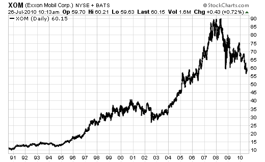
If you look at this chart alone, you might come to the
conclusion that Exxon is currently selling near its 5 year average, which
isn’t necessarily a bargain.
But my first chart
tells a slightly different story- that the world’s largest oil company is
selling at its 15 year lows, even though they’ve done nothing but grow
profits and market share in that time.
Oh, and they’ve grown their dividend payments as
well:
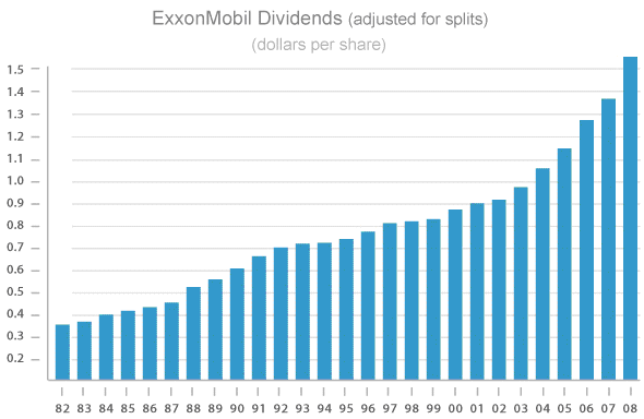
This chart only includes up to 2008, but the dividend has
since increased another 20 cents a share, up to $1.76, with a yield of
2.9%.
That’s almost as good as the current 10-year Treasury, but
Treasuries prices are currently near their all time highs- well off their 15
year lows.
With a trailing PE under 14 and a forward PE under 9, you’re
not likely to see Exxon sell this cheaply for much longer. I certainly don’t
expect this company to be this cheap – valued in gold or not- in another 15
years.
If you don’t own any shares of Exxon, you should, and now is
the perfect time to start building a position.
Good investing,
Kevin McElroy
Editor
Resource Prospector
P.S. I don’t pay a ton of attention to IPOs, but my boss Ian
Wyatt just put together a free report about how to successfully invest in
IPOs. I’ve arranged for you to access this free report called “The Dos and
Don’ts of IPO Investing.” All you have to do is
CLICK HERE to get your copy.
And there’s reason to be excited about IPOs…
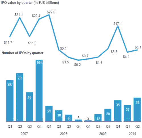
The IPO market has been heating up this year. During the
first two quarters of 2010 already 66 companies have gone public compared to
only 14 in the first two quarters of 2009. Taking a good look at the graphic
below it becomes apparent that the IPO market in late 2008 and early 2009 was
dismal. Little surprise there; but notice the nice uptick since then.