Before I get started I wanted to invite all of you to my upcoming webinar, “Profit in Any Market Using One High-Probability Trade.” This FREE live webinar event will take place next Wednesday, September 19th at 6:00 ET. Click here to join.
What do you think about more quantitative easing?
Admittedly, it has helped keep the market afloat over the past 3 ½ years. But for those dwelling on the effects of quantitative easing and what a potential injection has in store for the market Thursday, I have a chart that I think you will find quite interesting.
The chart below shows that the end effect of each successive QE seems to get dramatically more modest as the timeline gets dramatically more compressed. It’s like an infection that becomes more and more resistant to antibiotics.
So when Ben Bernanke actually comes out with the highly anticipated QE3, it’s very possible the next move could be extremely modest … and could potentially lead to a sharp reversal. If so, the S&P 500 (NYSE: SPY) could potentially hit the year-end price target of 1250 forecasted by many of the big banks such as Goldman Sachs (NYSE: GS).
Quite honestly, I hope Bernanke takes his last shot just to get it over with. But I'll go out on a limb and predict he does the following. He has one bullet left, and he knows once he shoots, it's over. He’ll have no more ammunition to help alleviate the ongoing economic woes.
And if he does decide to take this last shot, it’s my opinion that the injection will give the market one quick, final spurt and then send it spiraling down. Again, that's just my opinion based on the chart below.
However, rather than take his last shot, I think Big Ben will announce the same ol’, same ol’ – a bunch of nothing. The market will decline in disappointment and buyers will once again step in after another minor correction.
The latter scenario is probably Bernanke’s best choice because the threat of QE3 has been far more powerful than actually deploying it.
Again, just look at the chart below.
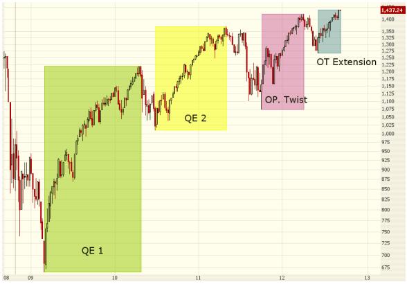
QE1 is green. Enormous move. QE2 is yellow. Large move, but significantly smaller than the move from QE1. Operation Twist is in purple. Even smaller move. Operation Twist extension is in blue. The smallest move to date.
Once thing is certain, though – the effect and potency of quantitative easing declines with each and every injection of stimulus. If the trend continues – and there’s no reason to believe it won’t – QE3 would be an even smaller move. Quite possibly – and perversely – it could actually reverse the market. That’s because the market will soon realize the safety net of quantitative easing no longer exists.
Kindest,
Andrew Crowder
Editor and Chief Options Strategist